 N O T I C E
MSPbots WIKI is moving to a new home at support.mspbots.ai![]() to give you the best experience in browsing our Knowledge Base resources and addressing your concerns. Click here
to give you the best experience in browsing our Knowledge Base resources and addressing your concerns. Click here![]() for more info!
for more info!
N O T I C E
MSPbots WIKI is moving to a new home at support.mspbots.ai![]() to give you the best experience in browsing our Knowledge Base resources and addressing your concerns. Click here
to give you the best experience in browsing our Knowledge Base resources and addressing your concerns. Click here![]() for more info!
for more info!
This package requires ConnectWise Manage, Quickbooks, and Xero integrations.
MSP Finance Team Financial Metrics Dashboard
This dashboard provides insights on a company's overall profitability and efficiency using data on Expenses, Revenue, Labor Hours, and Labor Costs, Enabling Business Owners and Service Managers a bird's eye view of financial performance to identify trends and issues for a more timely, informed, and effective decision making.
This dashboard can be filtered by Date Range. Users can drill through most widgets to view more details and breakdown of calculations.
Gross Margin
A card number showing the overall Gross Margin for the selected date range and a line graph showing the trend of Gross Margin for the last 6 months.
Gross Margin is Revenue minus Cost of Goods Sold (COGS) expressed as a percentage of Revenue: Total Revenue - Total COGS) / Total Revenue
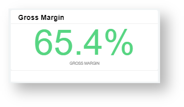
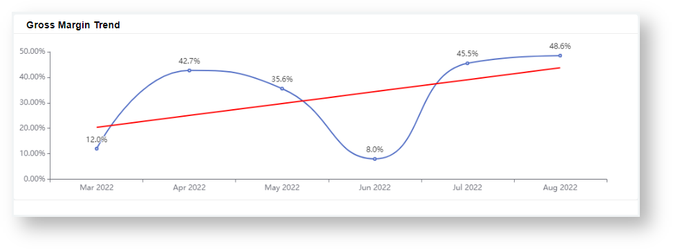
Data source: Xero P&L (SLI-Mapped) - for Revenue, COGS
Expense Margin
A card number showing the overall Expense Margin for the selected date range.
Expense Margin is the ratio of Expenses and Revenue: Total Expenses / Total Revenue
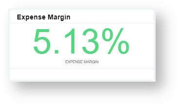
Data source: Xero P&L (SLI-Mapped) - for Revenue, Expenses
Debtor amount over 60 days as % of debt
A card number showing the total amount of Debts ageing for more than 60 days. Shows data for the selected date range.
Computed as the ratio of Overdue Invoices and all Aged Receivables: Total of Invoices ageing over 60 days / Total Aged Receivables
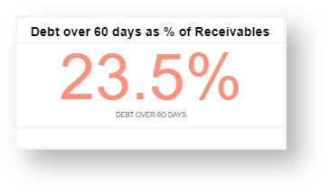
Data source: Xero Invoices - for Debt > 60 days, Total Aged Receivables
Normalized EBITDA
A table showing Normalized Earnings Before Interest, Taxes, Depreciation, and Amortization (EBITDA) for the last 6 months.
Computed as the ratio of Overdue Invoices and all Aged Receivables: Revenue + ITDA - Expense - COGS - Contributions & Drawdown

Data sources:
- Xero P&L (SLI-Mapped) - for COGS, Expenses, Revenue, Interest, Taxes, Depreciation, Amortization
- Teams - for Contributions & Drawdowns
% Billable Professional Utilization
A table and a line graph showing the percentage of Billable Professional Hours that are billable for the last 6 months.
Formula: Total Billable Hours / Total Worked hours
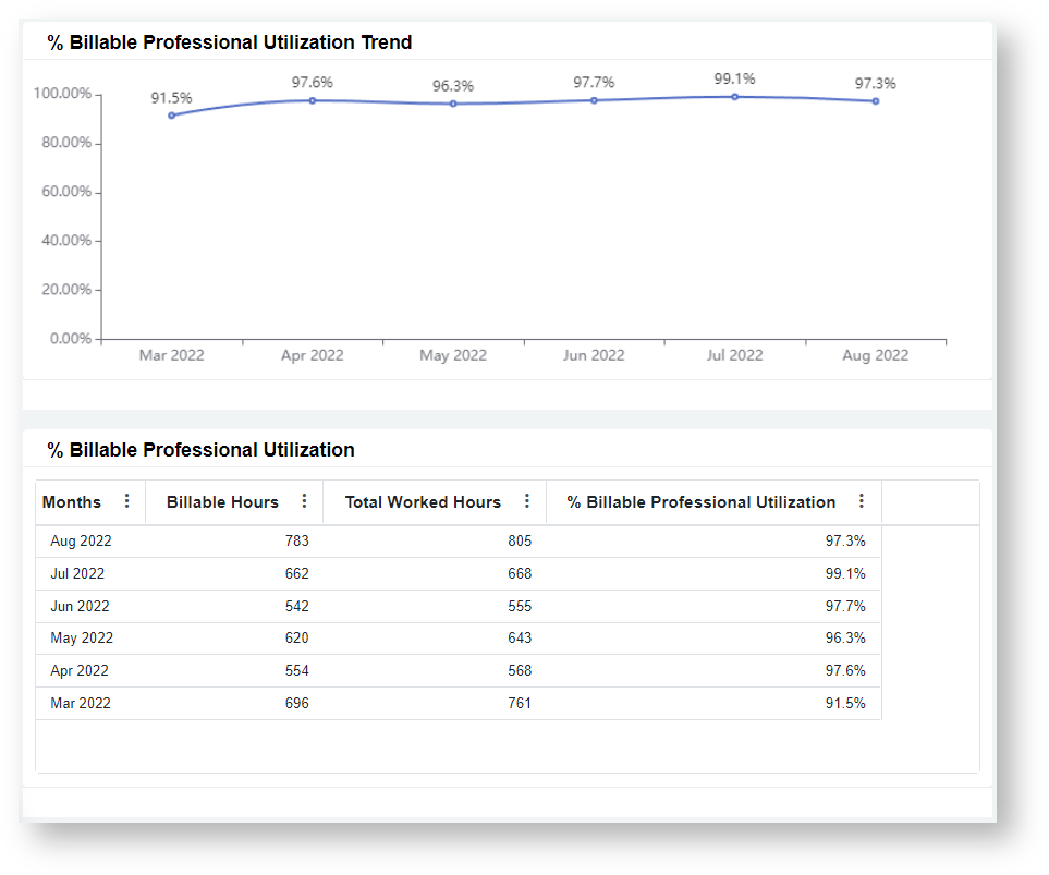
Data source: ConnectWise Manage Time Entries - for Billable Hours, Worked Hours
Total, Service, and Non-Service Revenue Trend
A mixed chart displaying the Service and Non-Service Revenues through columns and the Total Revenue through a line graph. Data shown is for the last 6 months.
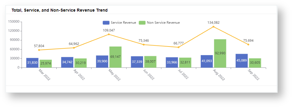
Data source: Xero P&L (SLI-Mapped) - for Services One Time Revenue, Monthly Recurring
Revenue per Endpoint
A table and a bar graph showing the ratio of Revenue and # of Endpoints for the last 6 months.
Formula: Total Revenue / Total Count of Endpoints
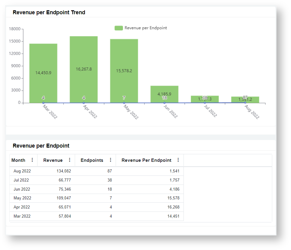
Data sources:
- Xero P&L (SLI-Mapped) - for Revenue
- MSP Finance Endpoints Form (MSPbots App) - for Count of Endpoints
Avg. Billable Professional Compensation
A table and a line graph showing the Average Compensation per Billable Professional for the last 6 months.
Formula: (Direct Wages + PAYE) / Count of Billable Professionals
*NOTE: Uses Direct Wages in calculation since PAYE in dataset is 0
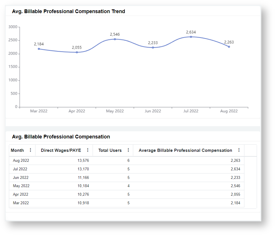
Data sources:
- Xero P&L (SLI-Mapped) - for Direct Wages, PAYE
- Teams - for Count of Billable Professionals
Service Revenue per Billable Professional
A table and a line graph showing the average Service Revenue generated per Billable Professional for the last 6 months.
Formula: Total Service Revenue / Count of Billable Professional
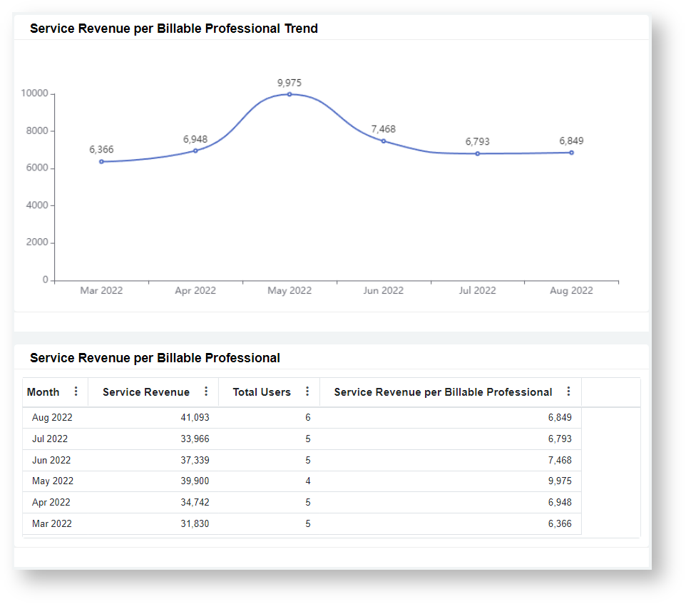
Data sources:
- Xero P&L (SLI-Mapped) - for Services One Time Revenue, Monthly Recurring
- Teams - for Count of Billable Professionals
Service Revenue to Direct Wages
A table and a mixed chart showing the Service Revenue, Direct Wages, and their ratio for the last 6 months.
Formula: Service Revenue / (Direct Wages + PAYE)
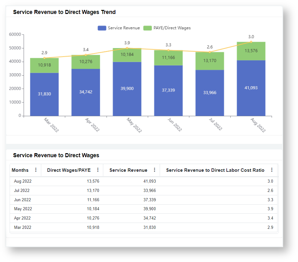
Data source: Xero P&L (SLI-Mapped) - for MRR Revenue, Services One Time Revenue, Direct Wages, PAYE
MSP Finance Team Financial Benchmarking Dashboard
The Dashboard overlays the company metric on a set of SLI based benchmark values to see where the metric compares over a certain period(s). For each metric, a company's performance is shown side by side with the MSP industry's Bottom 1/4 Average, Median, and Best in Class (BIC) Average.
This dashboard can be filtered by Date Range. Users can drill through most widgets to view more details and/or breakdowns.
MSPF Benchmark - Gross Margin generated per $1 Sales
A card number showing the overall Gross Margin generated per $1 of Sales & Marketing Expenses for the selected date range.
Formula: (Total Revenue - Total COGS) / Total Sales & Marketing Expenses
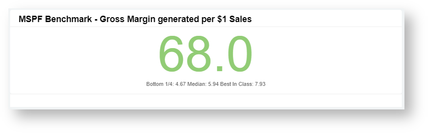
Data source: Xero P&L (SLI-Mapped) - for Revenue, COGS, Sales & Marketing Expenses
MSPF Benchmark - Blended Gross Margin %
A bar graph providing a benchmark for Gross Margin. Data is shown per month for the selected date range.
Formula: (Total Revenue - Total COGS) / Total Revenue
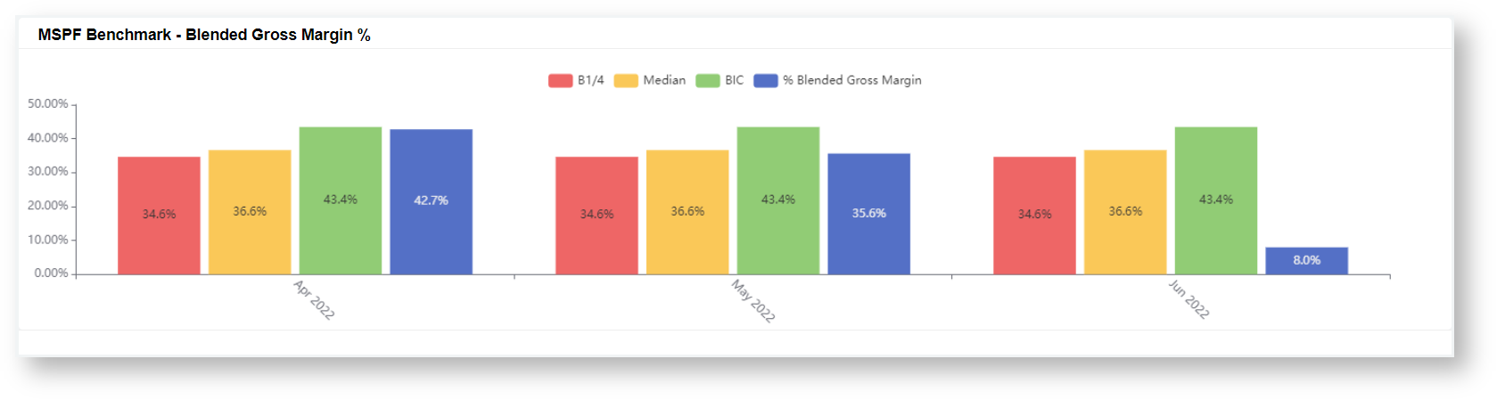
Data source: Xero P&L (SLI-Mapped) - for Revenue, COGS
MSPF Benchmark - Service Gross Margin %
A bar graph providing a benchmark for Service Gross Margin. Data is shown per month for the selected date range.
Formula: (Service Revenue - Services COGS) / Service Revenue
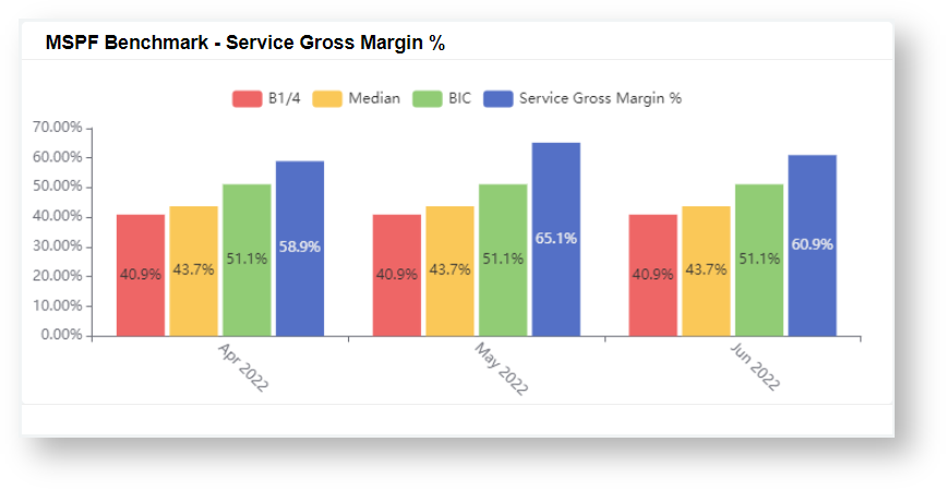
Data source: Xero P&L (SLI-Mapped) - for Service Revenue, Service COGS
MSPF Benchmark - Product Gross Margin %
A bar graph providing a benchmark for Product Gross Margin. Data is shown per month for the selected date range.
Formula: (Product Revenue - Product COGS) / Product Revenue
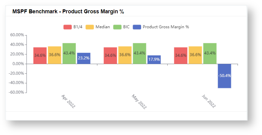
Data source: Xero P&L (SLI-Mapped) - for Product Revenue, Product COGS
MSPF Benchmark - SG&A %
A bar graph providing a benchmark for Selling, General and Administrative Expense (SG&A) as a % of Total Expenses. Data is shown per month for the selected date range.
Formula: SG&A Expenses/ Total Expenses
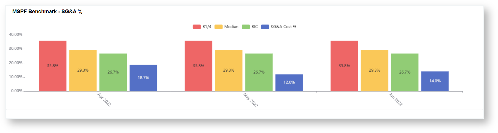
Data source: Xero P&L (SLI-Mapped) - for SG&A Expenses, Total Expenses
MSPF Benchmark - Sales Cost %
A bar graph providing a benchmark for Sales Expenses as a % of Total Expenses. Data is shown per month for the selected date range.
Formula: Sales Expenses / Total Expenses
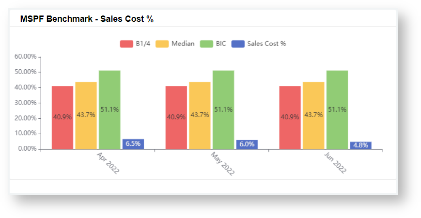
Data source: Xero P&L (SLI-Mapped) - for Sales Expenses, Total Expenses
MSPF Benchmark - G&A Cost%
A bar graph providing a benchmark for General and Admin Expenses as a % of Total Expenses. Data is shown per month for the selected date range.
Formula: General and Admin Expenses / Total Expenses
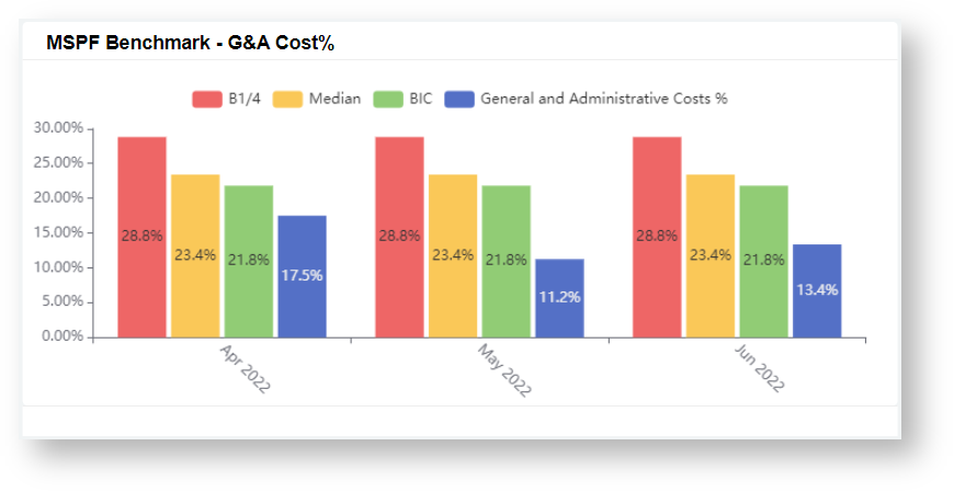
Data source: Xero P&L (SLI-Mapped) - for General and Admin Expenses, Total Expenses
MSPF Benchmark - EBITDA %
A bar graph providing a benchmark for Earnings Before Interest, Taxes, Depreciation, and Amortization (EBITDA) as a % of Total Revenue. Data is shown per month for the selected date range.
Formula: (Revenue - Expense) / Total Revenue
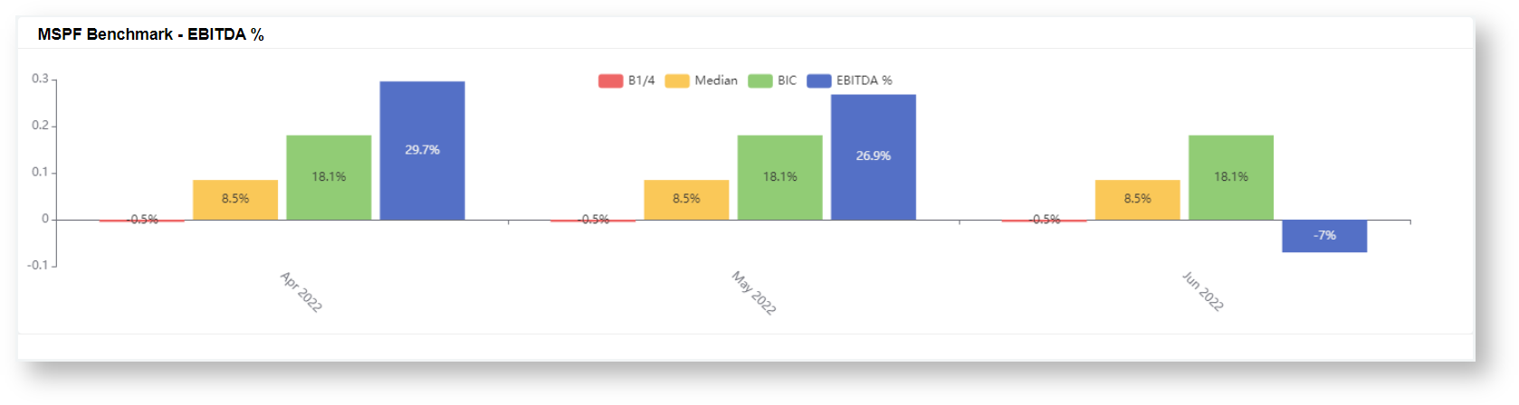
Data source: Xero P&L (SLI-Mapped) - for Expenses, Revenue
Overview
Content Tools
N O T I C E
MSPbots WIKI is moving to a new home at support.mspbots.ai![]() to give you the best experience in browsing our Knowledge Base resources and addressing your concerns. Click here
to give you the best experience in browsing our Knowledge Base resources and addressing your concerns. Click here![]() for more info!
for more info!