 N O T I C E
MSPbots WIKI is moving to a new home at support.mspbots.ai to give you the best experience in browsing our Knowledge Base resources and addressing your concerns. Click here for more info!
Page History
...
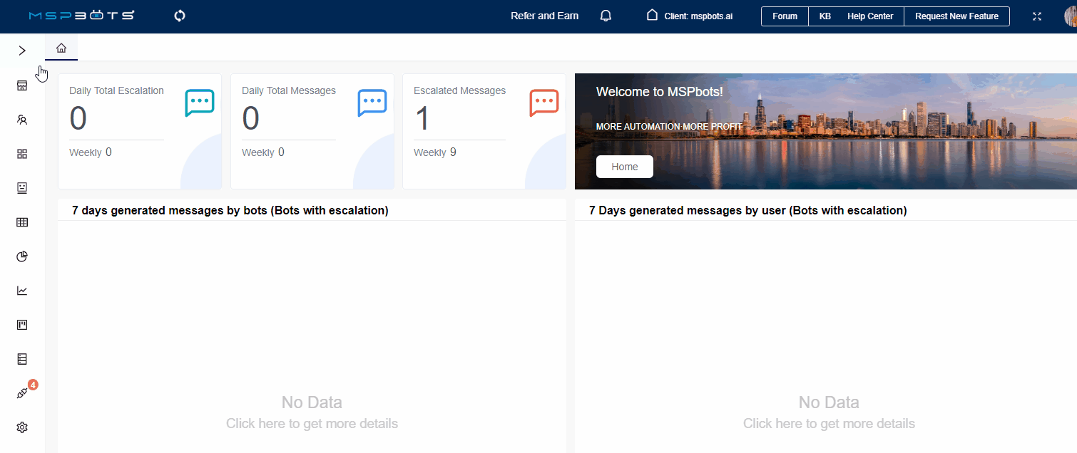
- Navigate to Widgets on the MSPbots app menu .
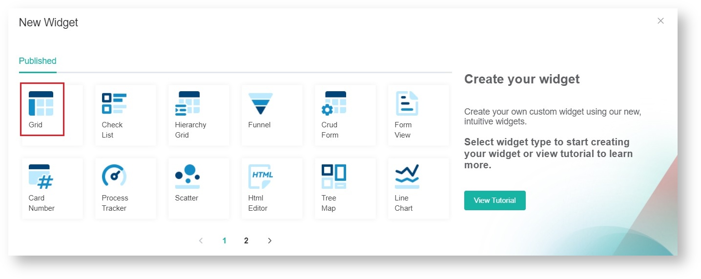
 Under My Widgets, and click New Widget.
- Choose the Grid widget type on the New Widget window.
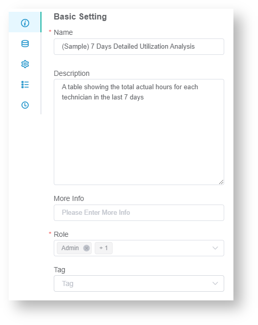
- When the Widget Builder window opens, go to the Basic Setting tab. Provide the following and click Apply:
- Name - Give the widget a name.
- Description - Give the widget a short description.
- Role - Select the roles that should will have access to the widget.
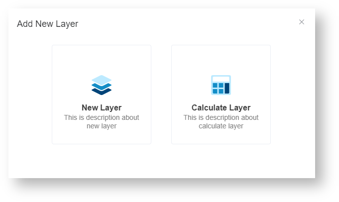
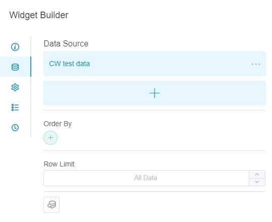
- Go to the Dataset tab. Click the
 button and select
  and select New Layer.
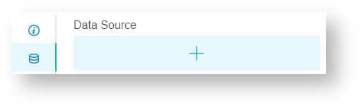
- On In the Dataset window,
- Select the Dataset containing with the information data you want to use.need.
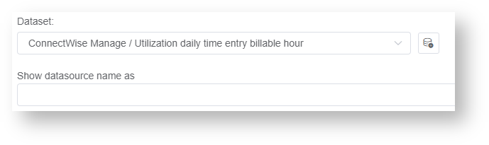
- Enter a datasource name in the Show datasource name as field. (Optional)
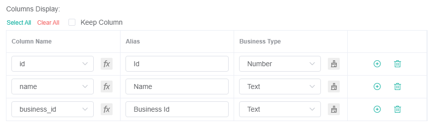
- For Columns Display,
- Using Go to the Column Name dropdown , and select the field you want to show in a field for the drill-through. Click the button to add more rows.
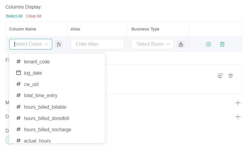
- Give an an Alias and and select a a Business Type for each row.
 Type for your selection.
 - Click
 to add more rows.
- Using Go to the Column Name dropdown , and select the field you want to show in a field for the drill-through. Click the
- For Filter
- Clickand choose either Add Condition or
- Click the button and choose between Add Condition and Add Group.
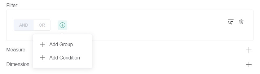
- Select Add all the fields you want to filter.
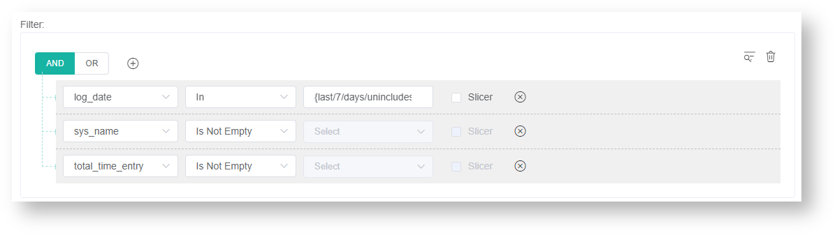
- Set a condition/logic conditions for each field using the next subsequent two dropdowns. For a guide on each option on the list, refer to : the article What Conditions are Available for Creating Widgets?
- Select a the logical operator AND or OR for the filter group (AND or OR).
- Click
- For Measure,
- Click the button to show
 sign corresponding to Measure.
- When the Measure window .Select opens, select a Summary Type.
- Select a Field to use in the computation.computation option from the Fields list.
- Type Give an Alias for the measure.
- Select a Format Type.
- Click Add.


- Click the
- For Dimensions, Dimension,
- Click the sign corresponding to Dimension.

- Select a field to be used for grouping option from the data Fields dropdown.
- Give an Alias for the measuredimension.
- Select a Format Type.
- Click Add.


- Click the
- For DrillThrough Order By,
- Click the
 button.
 - Select a parameter to automatically sort drill-throughs.

- Click the
- For Order By (Optional)
- Click the button.
- Select a parameter to sort the data.

- Click the
- Row Limit - Select an option to set Other optional settings are:
- Order By - Sorts the data in the drill-down based on the selected field. Row Limit - Sets a limit on how many rows of data will be shown in the drill-down.

These two options are also available on the dataset tab, the difference is that they apply to the grid widget shown instead of . (Optional)
- Select the Dataset containing with the information data you want to use.need.
- Remove duplicate data - Select this option if you have duplicate data to delete.

- Materialized - Select an option according to your requirements.

- Click Save to keep the Dataset configuration.
Click Save.Tip The optional settings Order By and Row Limit are also available in the Widget Builder window. The settings configured in this area are applied to the grid widget. If the configurations were done in the Dataset window, the settings are applied on the drill-down.
- Under Grid Option:

- Font Size - Set the font size for the text in the table.
- Grid Style - Select the style of the grid for the table. Click
 and select any of the following:
 - Data Grid - Shows all the tables
- Table - Lets you customize the parameters to show on the widget by clicking.

- Grid Lines - Select the type of grid lines to use for the table. (default, both, none, horizontal, vertical)
- Toolbar - Select the file types for the export feature.
- Show Paging - If toggled on, this will show the paging settings at the bottom of the table.
- Show Toolbar - If toggled on, this will show the toolbar at the top of the table.
- Auto Fit - If toggled on, this will enlarge the page font size and users can scroll with the scroll bar to view the table. If toggled off, this will automatically adjust the page size to show all the data on that page.
- Auto Scroll
- Show Export Option - This option applies onlywhen the PDF is the option selected for Toolbar.
- If enabled, clicking PDF Export will show the followingexport options:
- Page orientation:
- Portrait - vertical
- Landscape - horizontal
- Page size:
Select the appropriate size.
- Page orientation:
- If disabled, clicking PDF Export, will export the PDF file with the following default settings:
- Page orientation: Portrait
- Page Size: A4
- If enabled, clicking PDF Export will show the followingexport options:
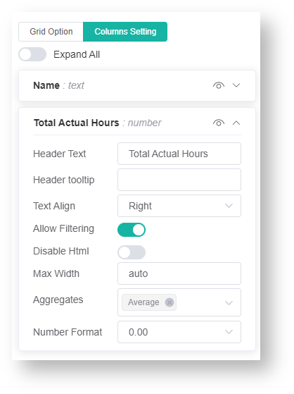
- Under Columns Setting, edit the following options
- Font Size - Set the font size for the text in the table.
 Under Column Settings, you can edit the following for each column:
 - Header Text - Assign a column name.
- Header Tooltip - Add a tooltip for the column.
- Text Align - Set to the Left, Center, or Right.
- Allow Filtering - Toggle to allow users to filter the column.
- Disable HTML - Toggle to disable the use of HTML codes.
- Max Width - Set the width for the column.
- Aggregates -
- Select if the column's total will be included at the bottom of the table (
- Sum,
- Count,
- Avg,
- Min,
- or Max).
- Number Format
- only Set how many decimal places will be shown for the aggregate. (This is available only
- if
- Avg is selected.)
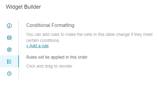
- Click the +Add a rule link.
- Enter and assign a name for the new widget rule.
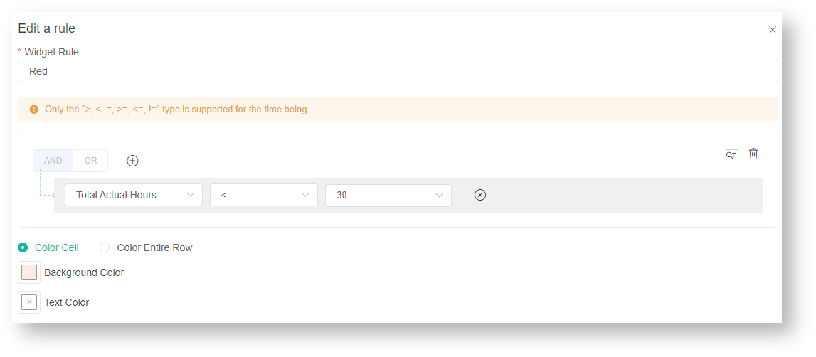
- Set the conditions for the rule.
- Select the format to be applied once conditions are satisfied. Choose You can apply color to apply a cell or row color.
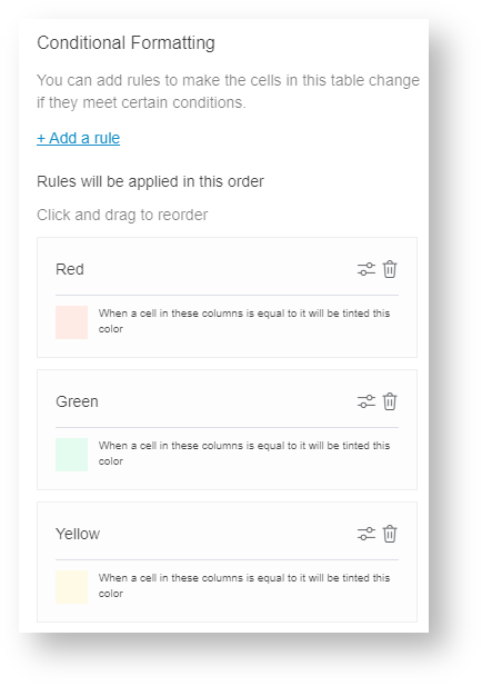
- Click Apply
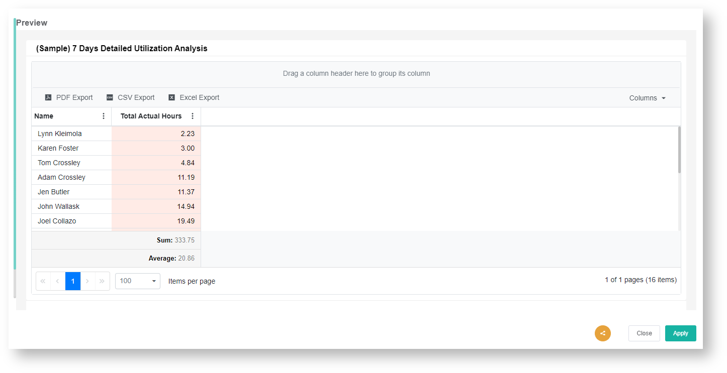
- to save and show a preview of the grid widget you created.
| Content by Label | ||||||||||||
|---|---|---|---|---|---|---|---|---|---|---|---|---|
|
Overview
Content Tools