 N O T I C E
MSPbots WIKI is moving to a new home at support.mspbots.ai to give you the best experience in browsing our Knowledge Base resources and addressing your concerns. Click here for more info!
N O T I C E
MSPbots WIKI is moving to a new home at support.mspbots.ai to give you the best experience in browsing our Knowledge Base resources and addressing your concerns. Click here for more info!
This article shows how to create a pivot table widget.
A pivot table is a data analysis tool that allows for flexible and quick summarization and visualization of large amounts of data. Its advantages include flexibility, quick summarization, data visualization, and interactivity. However, pivot tables also have some drawbacks, such as the inability to directly edit data, complexity, and limitations on data size. Pivot tables are commonly used when there is a need to analyze sales, financial, or economic data, explore correlations and trends, make comparisons and contrasts, and generate reports quickly. In summary, a pivot table is a powerful tool that supports decision-making and strategic planning.
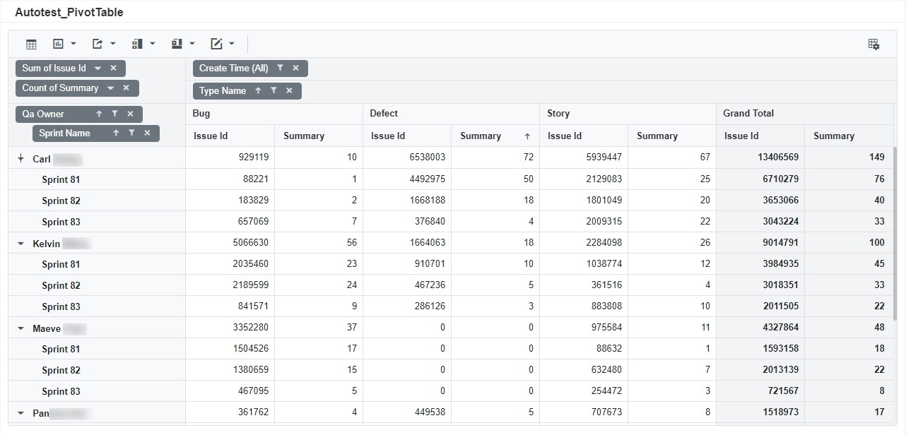
An example of a pivot table widget:
How to Create a Pivot Widget
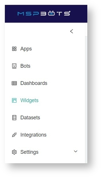
- Navigate to Widgets on the MSPbots app menu.
- On the Widgets tab, click My Widgets.
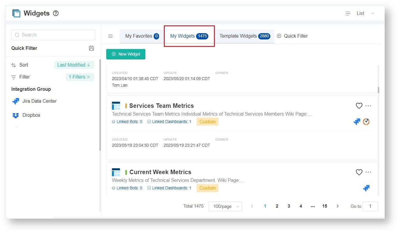
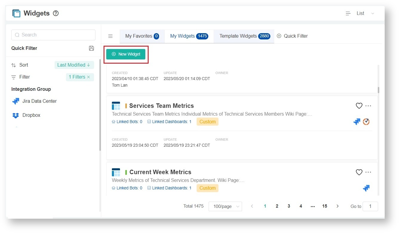
- Next, click the New Widget button.
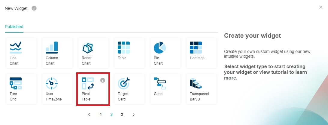
- Select the Pivot Table widget type on the New Widget window.
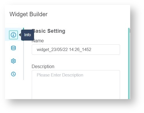
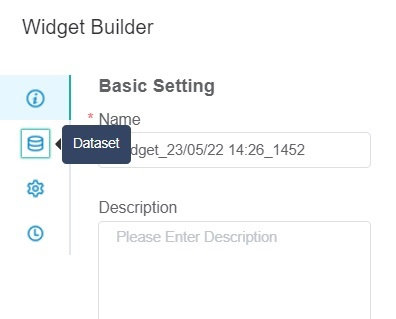
- When the Widget Builder window opens, click Info on the menu.
- Provide the following under Basic Setting.
- Name - Give the widget a name.
- Description - Give the widget a short description.
- Role - Select or edit the roles that will have access to the widget. The roles selected by default are Admin, User, and Dashboard Only.
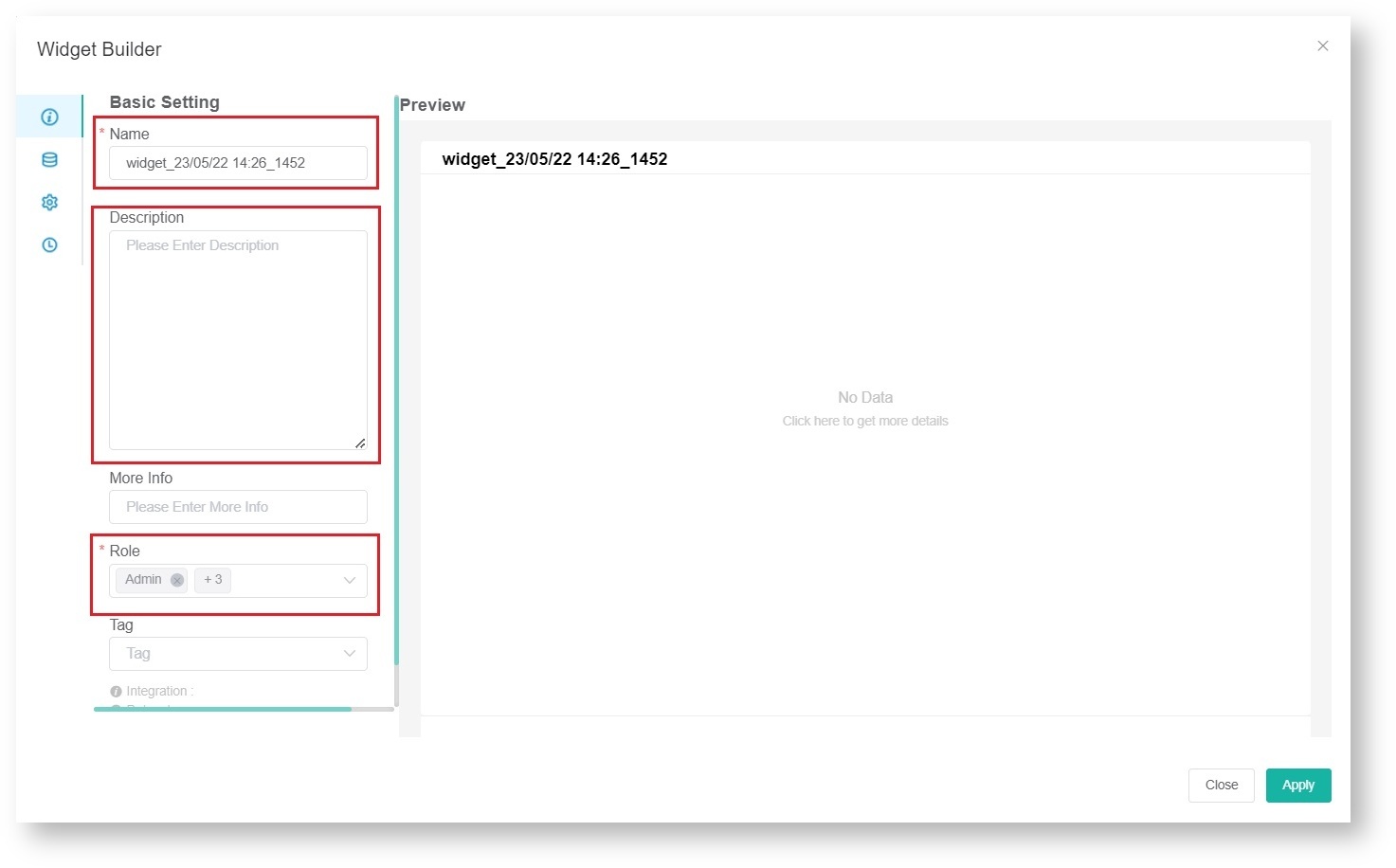
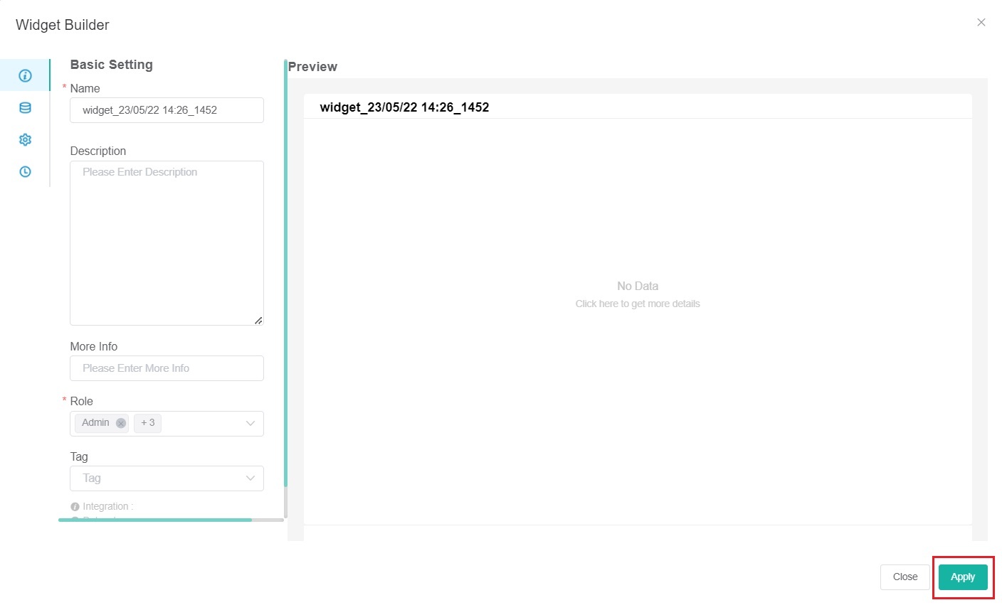
- Click Apply when done.
 ???
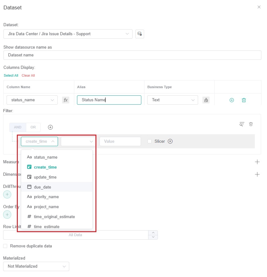
??? - Next, go to Dataset on the menu.
- Under Data Source, click the
 button.
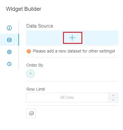
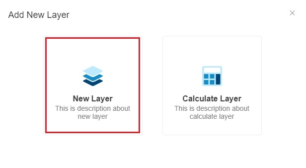
- Select New Layer when the Add New Layer window opens. This action will bring up the Dataset window.
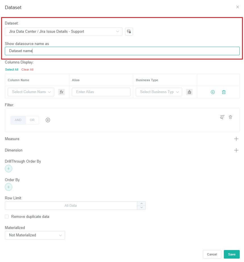
- On the Dataset window,
- Select the Dataset containing the information you want to use. You can also give a name for the Datasource (optional).
- For Columns Display,
- Go to the Column Name dropdown and select the field you want to show in the drill-through.
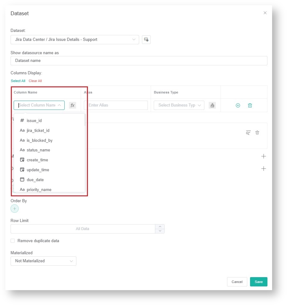
Click to add more rows.
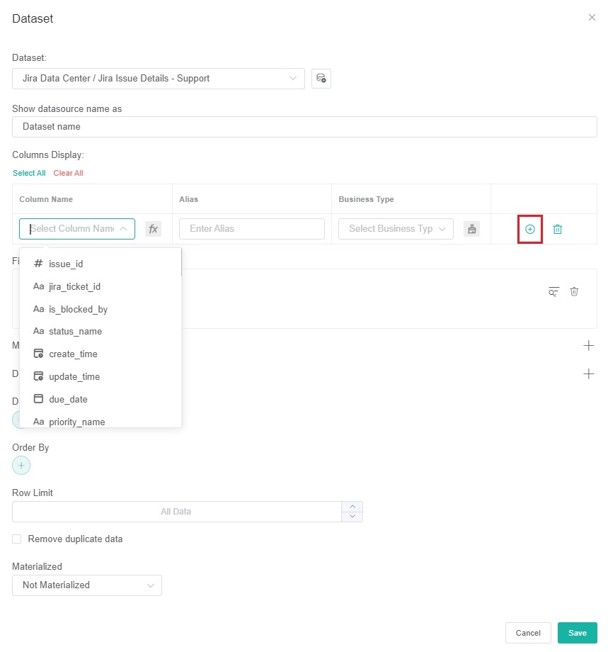
- Give the column an Alias and select a Business Type for it. Do this for every row that you create.
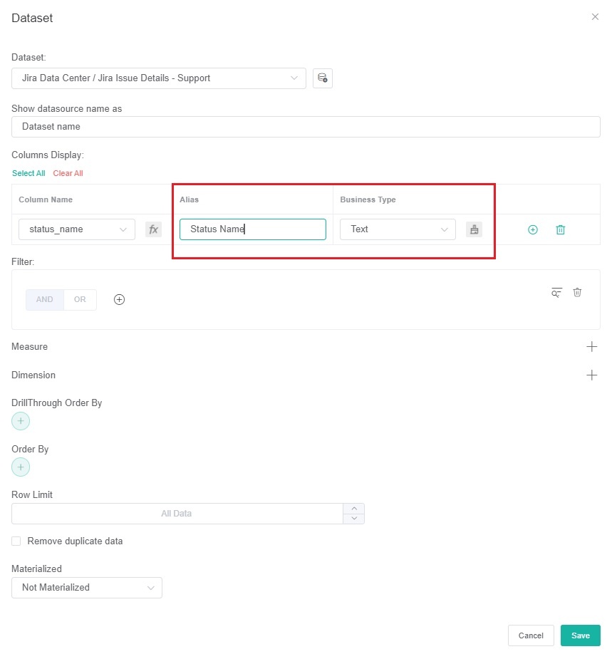
- If the selected Business Type is Number, read the article Options for Custom Formatting in Your Widgets and Dashboards for help with formatting numbers in your widgets.
- Go to the Column Name dropdown and select the field you want to show in the drill-through.
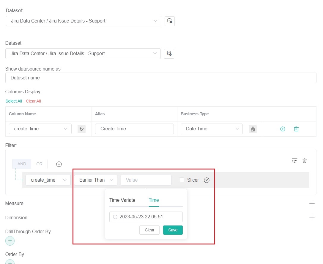
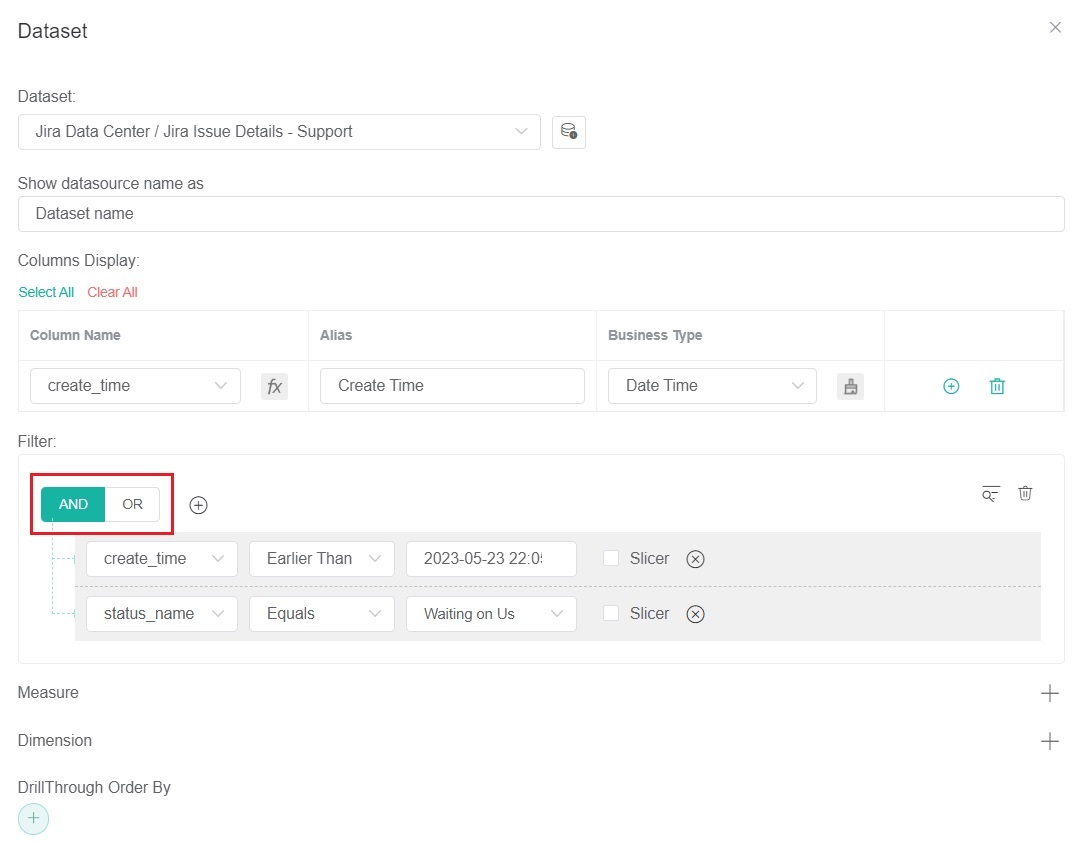
- For Filter,
- Click the
 button and choose between Add Condition and Add Group.
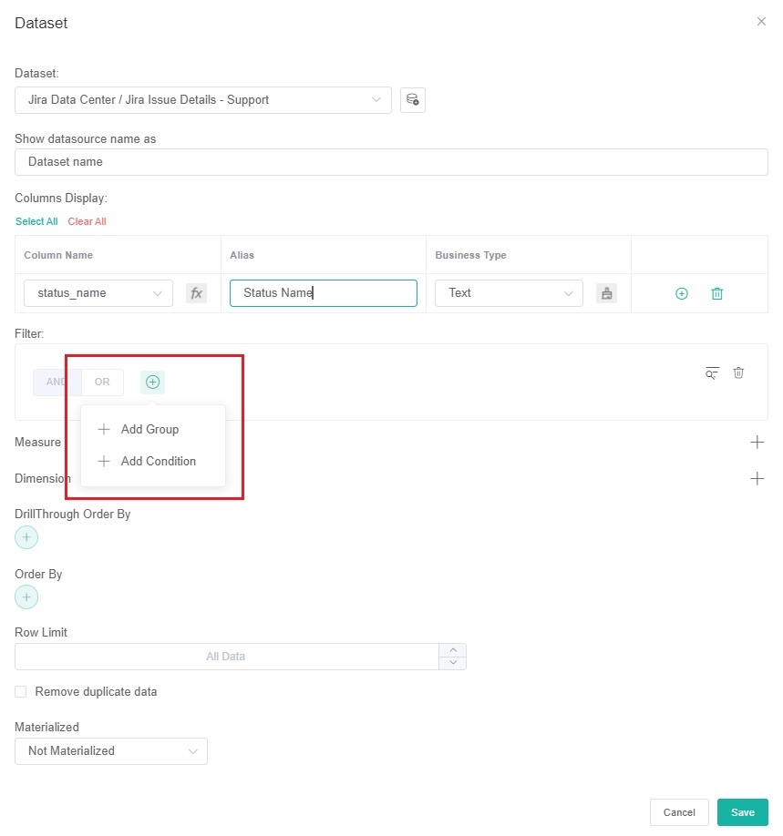
- Select a filter from the first dropdown list.
- Next, set a condition or logic for each field using the next two dropdowns. Refer to the article What Filter Conditions and Formats are Available for Creating Widgets for the descriptions of each condition.
- Repeat Steps c.i to c.iii to add more conditions.
- When you have added all the conditions you need, select the logical operator AND or OR for the filter group.
- Click the
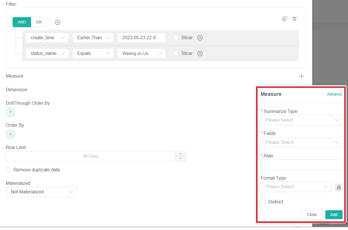
- (Optional)For Measure,
- Click the
 button to show the Measure window.
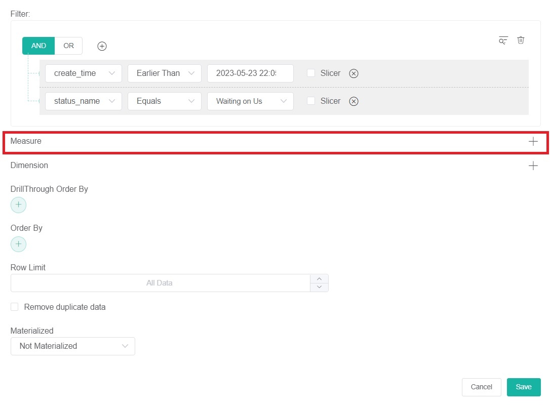
- On the Measure window, select a Summary Type.
- Select a Field to use in the computation.
- Enter an Alias for the measure.
- Select a Format Type.
- Then click Add.
- Click the
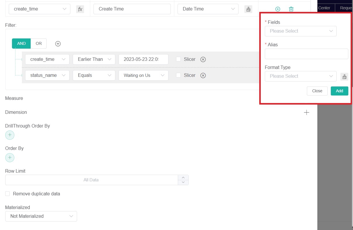
- (Optional)For Dimensions,
- Click the button.
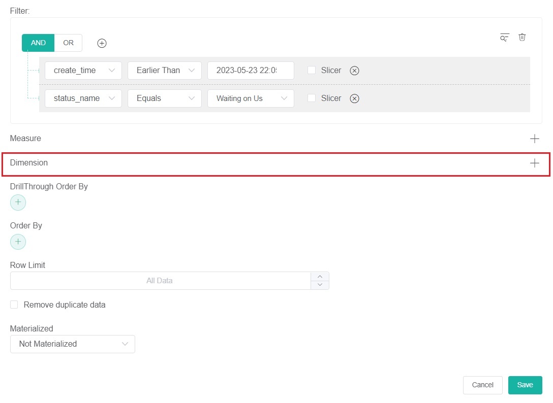
- Click on Fields and select an option for grouping the data.
- Next, enter an Alias for the measure.
- Select a Format Type.
- Then click Add.
- Click the
- (Optional)For DrillThrough Order By,
- Click the
 button.
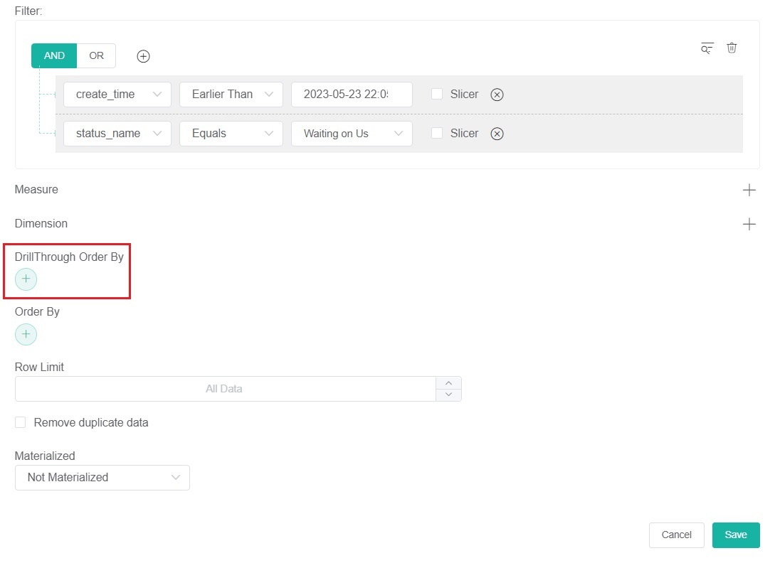
- Select a parameter to automatically sort data according to your selection.
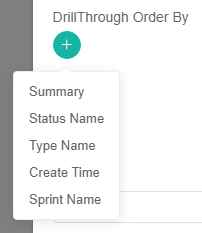
- Click the
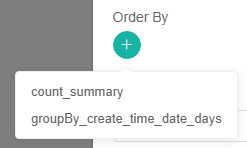
- (Optional)For Order By,
- Click thebutton.
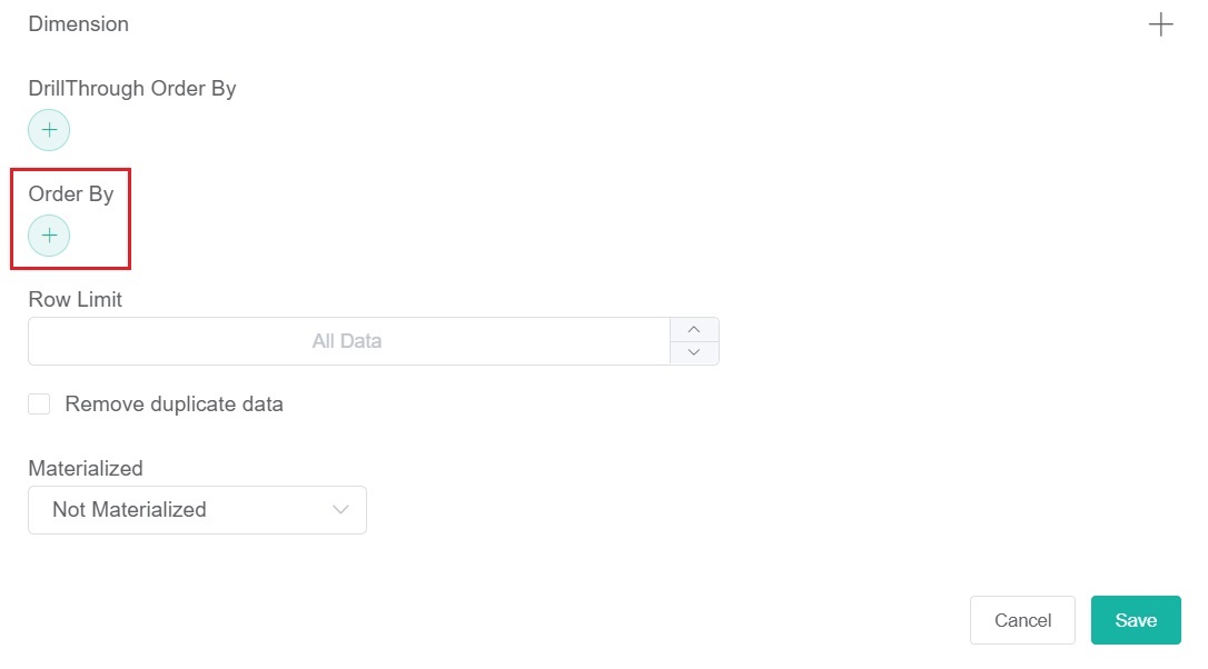
- Select a parameter to sort the data based on your selected field.
- Click the
- (Optional)Next, select a Row Limit to set a limit to the number of rows on your widget.
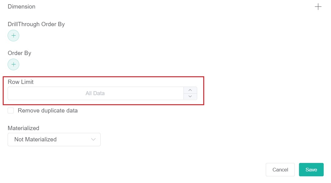
- (Optional)Tick the checkbox for Remove duplicate data to delete duplicate data based on your set conditions.
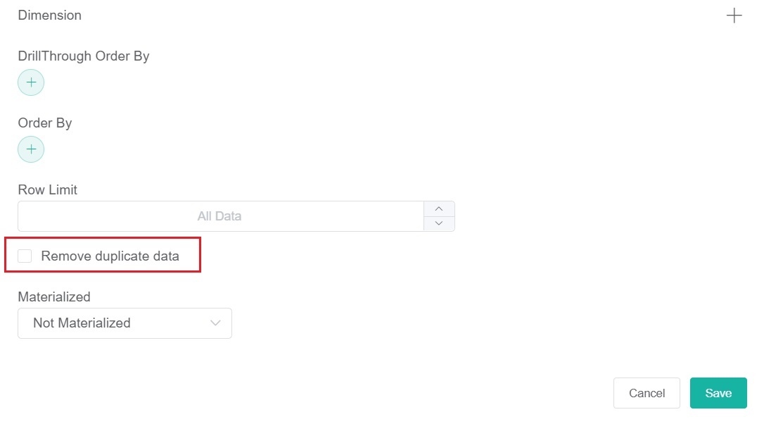
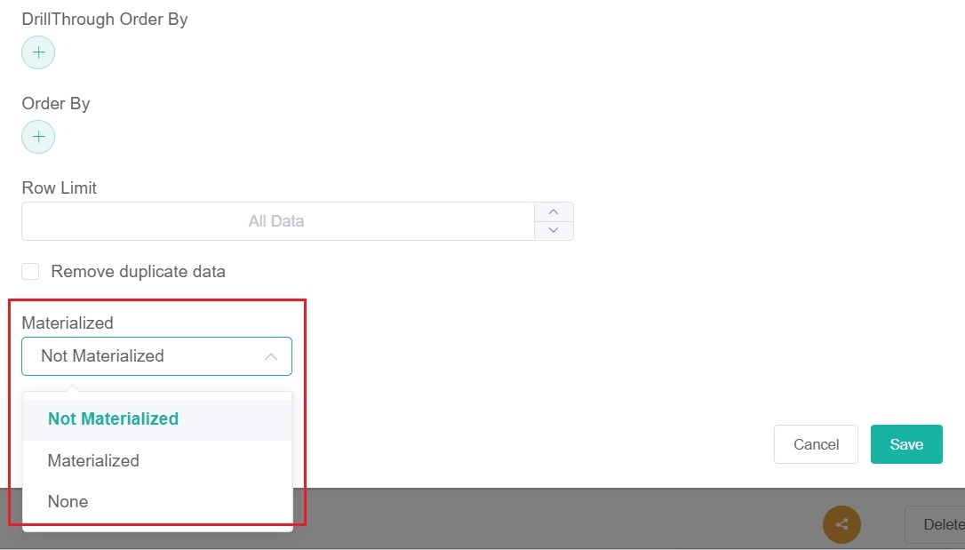
- (Optional)Then select an option from the Materialized dropdown to materialize data based on the actual conditions.
- Click Save to keep the configuration.
- Select the Dataset containing the information you want to use. You can also give a name for the Datasource (optional).
- Move on to Config on the menu.
Other optional settings:
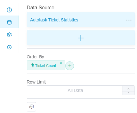
The following options are also available on the Dataset tab. When applied, these two settings reflect on the pivot table instead of the drill-down.- Order By - Sorts the data based on the selected field.
- Row Limit - Sets a limit to the number of rows that appear on the widget.
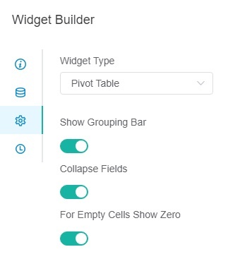
Do the following:- Widget Type - You can switch this widget to different widget types. If you want to learn more, please refer to How to Switch Widget Types.
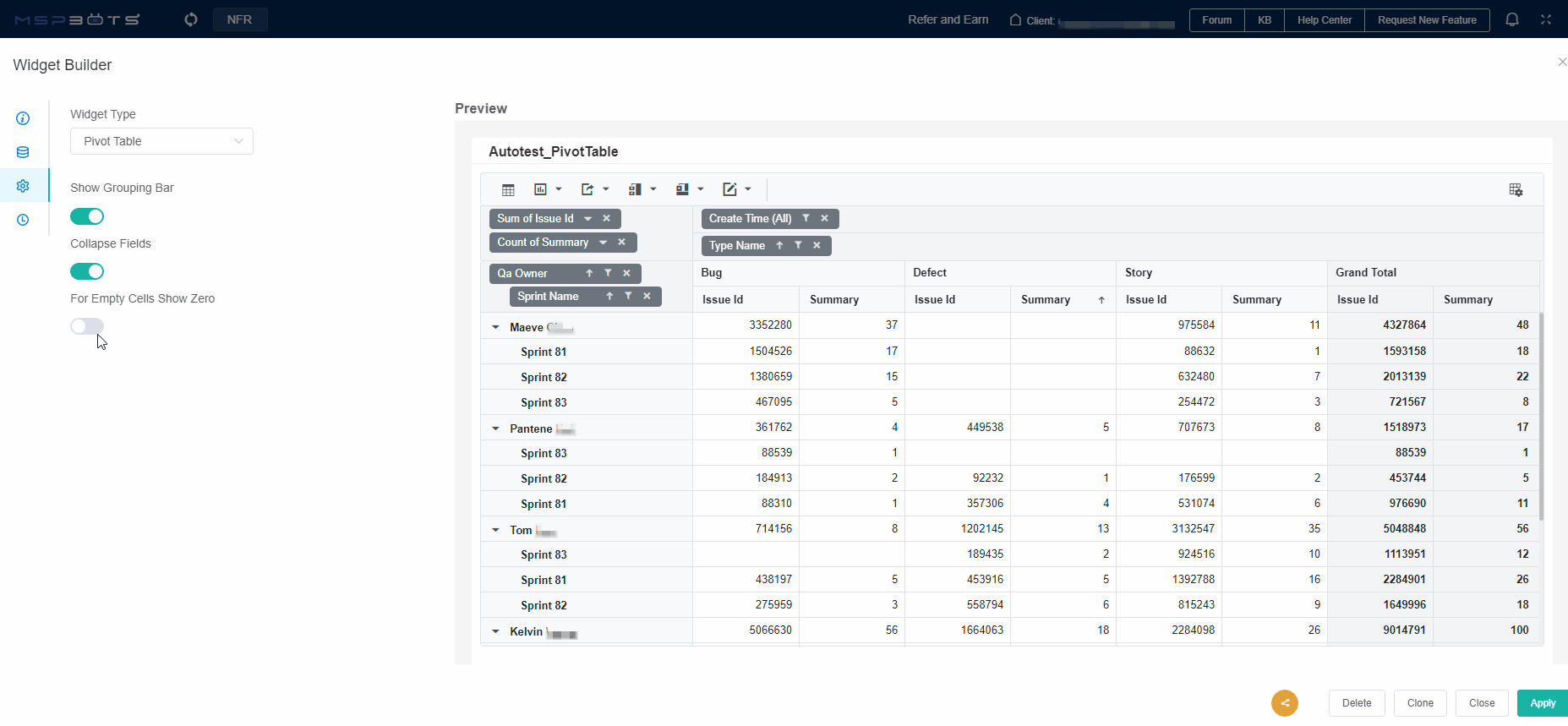
- Show Grouping Bar - This is the toggle for hiding or showing the row fields, column fields, value fields, and filter fields in the pivot table.
When turned on, it will display the row fields, column fields, value fields, and filter fields.
When turned off, it will not display them.
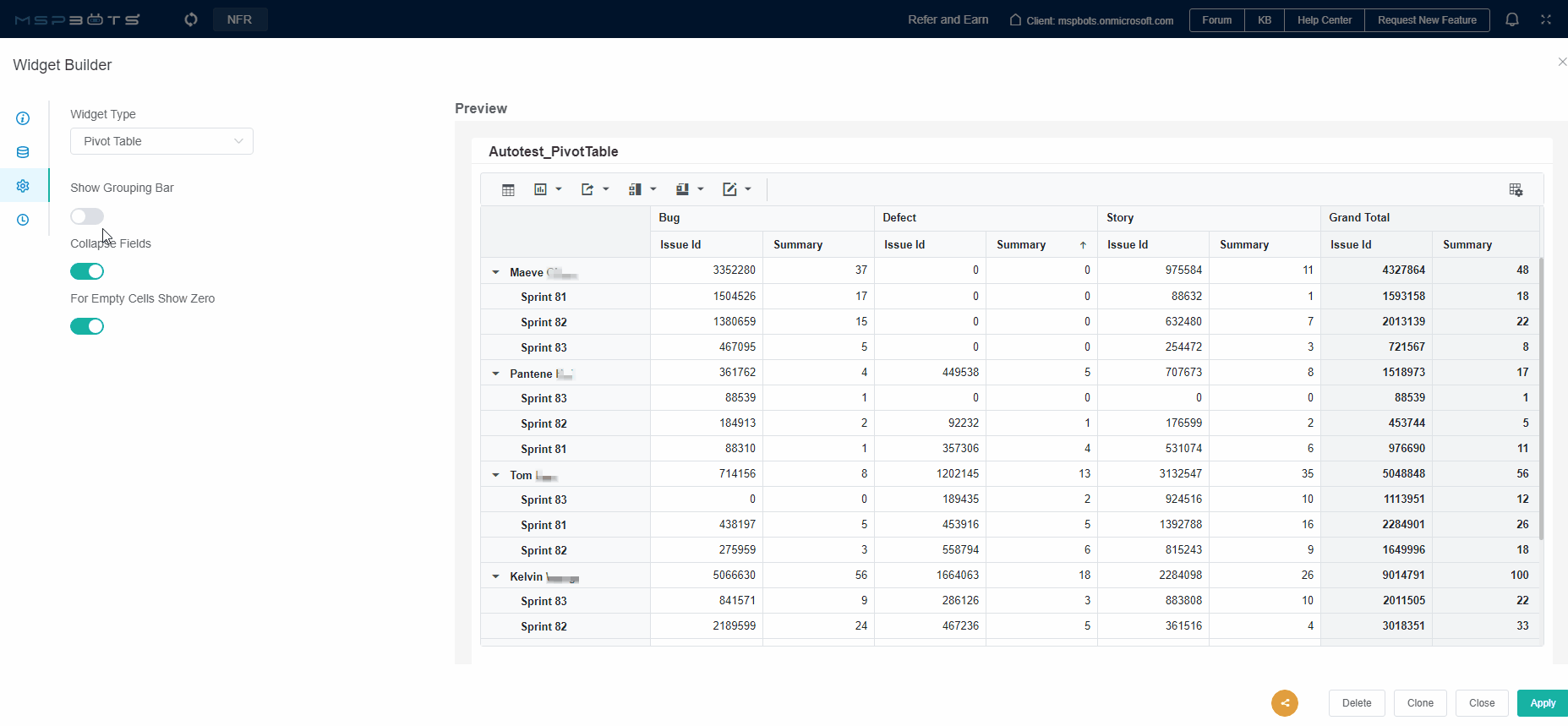
Collapse Fields
When this toggle is turned on, all column fields in the table will be expanded when you open the widget.
When it is turned off, collapsible column fields will be collapsed when you open the widget, and only non-collapsible column fields will be displayed.
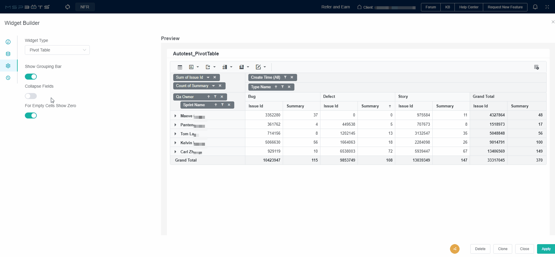
- For Empty Cells Show Zero
- When this toggle is turned on, empty values will be displayed as 0.
- When it is turned off, empty values will be displayed as blank.
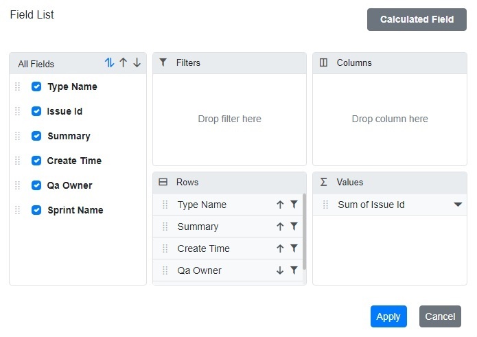
- Click on the
 located at the top right corner of the Preview page to access the Field List pop-up.
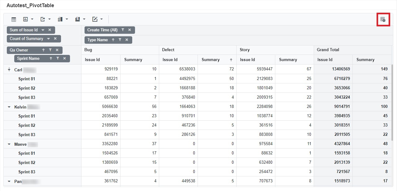
- The fields listed under "All Fields" are sourced from the fields set in the Data Source. Please check the fields you want to display in the pivot table under "All Fields". These fields will be automatically displayed in the Filters, Columns, Rows, or Values section respectively.
- If you want to adjust the position of each field, drag the
 in front of each field. Place the mouse cursor over it until the cursor icon changes to Drag, then drag the field to the area where you want it to be displayed.
 - Click Apply.
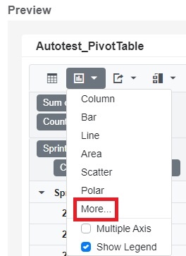
- In the action column above the pivot table, you can edit the format of the table.
- Clicking on
 the Show table button displays the pivot table in table style.
 Clicking on
 to switch the widget to another type.
Column
Bar
Line
Area
Scatter
Polar
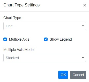
If none of the above chart types meet your needs, please click "More" and set the chart type you need in the "Chart Type" within the Chart Type Settings.
Multiple Axis: If selected, you can configure the "Multiple Axis Mode" with options such as "Stacked" or "Single".
Show Legand: If checked, the pivot table is displayed as a line chart. Clicking on "Show table" button allows you to return to table style.
- Click on
 to export the table as PDF, Excel or CSV format.
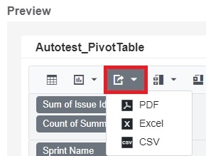
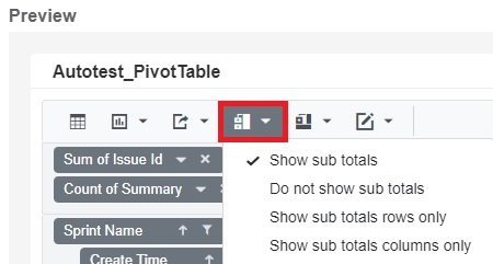
- Click on
 to set sub totals.
 - Show sub totals
- Do not show sub totals
- Show sub totals rows only
- Show sub totals columns only
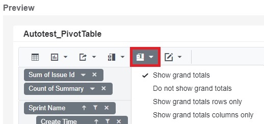
- Click on
 to set grand totals.
 - Show grand totals
- Do not show grand totals
- Show grand totals rows only
- Show grand totals columns only
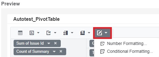
- Click on
 to set formatting.
- Number Formatting
- Conditional Formatting
- Clicking on
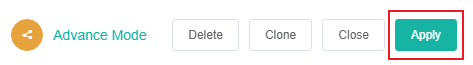
- Finally, click Apply. This will show a preview of the pivot table.
Overview
Content Tools
N O T I C E
MSPbots WIKI is moving to a new home at support.mspbots.ai to give you the best experience in browsing our Knowledge Base resources and addressing your concerns. Click here for more info!