 N O T I C E
MSPbots WIKI is moving to a new home at support.mspbots.ai![]() to give you the best experience in browsing our Knowledge Base resources and addressing your concerns. Click here
to give you the best experience in browsing our Knowledge Base resources and addressing your concerns. Click here![]() for more info!
for more info!
Page History
The MSP Finance Team Financial Metrics and Benchmarks Suite Dashboards feature reports for each identified Key Performance Indicator (KPI) and benchmarking widgets to compare your company's metrics against industry standards over a selected period. These highlight how your company's performance compares with the MSP industry's benchmarking categories. You can filter values in the dashboards and drill through most widgets for breakdowns and to show more details.
The MSP Finance Team Financial Metrics and Benchmarks Suite This package requires ConnectWise Manage, Quickbooks, and Xero integrations.
What's in this article:
| Table of Contents |
|---|
MSP Finance Team Financial Metrics Dashboard
This dashboard provides insights on a company's overall profitability and efficiency using data on Expenses, Revenue, Labor Hours, and Labor Costs, Enabling Business Owners and Service . It gives business owners and ervice Managers a bird's eye view of financial performance to identify trends and issues for a more timely, informed, and effective decision making.
...
Data source: Xero P&L (SLI-Mapped) - for MRR Revenue, Services One Time Revenue, Direct Wages, PAYE
MSP Finance Team Financial Benchmarking
...
Dashboards
The Dashboard overlays the company metric on a set of SLI-based benchmark values to see where the metric compares over a certain period(s). For each metric, a company's performance is shown side by side with the MSP industry's Bottom 1/4 Average, Median, and Best in Class (BIC) Average.
...
Data source: Xero P&L (SLI-Mapped) - for Expenses, Revenue
MSPF Aggregated and Monthly Dashboards
The MSP Finance Team Financial Metrics and Benchmarks Suite dashboards use the Service Leadership Index (SLI) to calculate metrics and benchmarks. Data are presented in aggregated and monthly reports so you can get insights from different levels of detail according to the specific needs and goals of your organization.
MSPF SLI Mapping Aggregate Dashboard
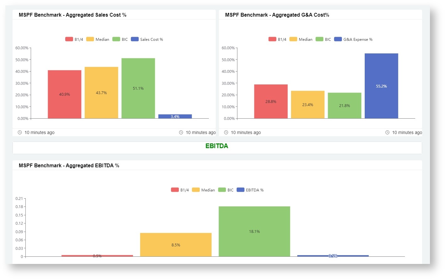
The MSPF aggregated dashboards put together data across a longer time period, such as a quarter or a year, to show a general overview of performance. Aggregated dashboards are useful in identifying overall trends in performance over time and show if your company's performance has been improving or declining during this period.
Below are examples of MSPF Aggregated Dashboards
MSPF SLI Mapping by Month Dashboard
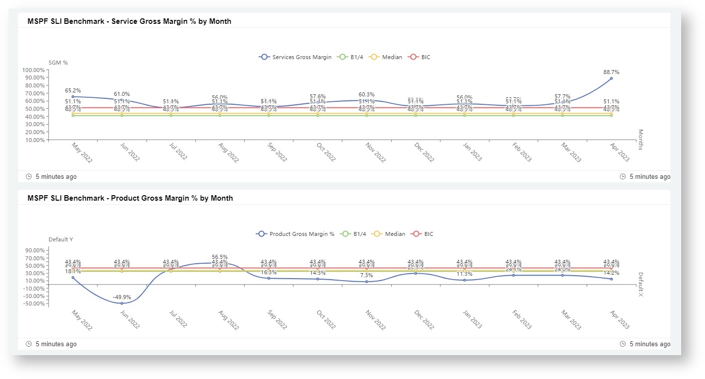
The MSPF monthly dashboards present data over months to identify and analyze trends and patterns in SLI performance during shorter time periods. These dashboards are useful for identifying seasonal or cyclical patterns in your company's performance. It highlights if performance is consistently better or worse during certain months of the year.

