 N O T I C E
MSPbots WIKI is moving to a new home at support.mspbots.ai![]() to give you the best experience in browsing our Knowledge Base resources and addressing your concerns. Click here
to give you the best experience in browsing our Knowledge Base resources and addressing your concerns. Click here![]() for more info!
for more info!
N O T I C E
MSPbots WIKI is moving to a new home at support.mspbots.ai![]() to give you the best experience in browsing our Knowledge Base resources and addressing your concerns. Click here
to give you the best experience in browsing our Knowledge Base resources and addressing your concerns. Click here![]() for more info!
for more info!
A Line Chart widget is another widget type that MSPbots users can utilize to highlight key data and identify actionable items. It is helpful when you want to visualize trends in data and measure the impact of these trends on your MSP's operations and goals over time.
What's in this article
How to design a line chart widget
- On the MSPbots menu, navigate to Widgets.
- On the Widgets tab, click New Widget. This action opens the New Widget window.


- When the Widget Builder window opens, provide the following:
- Name - Give the widget a Name.
- Description - Provide a short Description.
- Role - Select User or Admin.

- Click the Apply button.
- Go to Dataset and click
 button.
- When the Add New Layer window appears, click New Layer.

- Do the following on the Dataset window:
- Select a dataset to use.
- Provide a name for the dataset used.
- Add columns by selecting an option from the Column Name dropdown list and assigning an Alias and Business Type for each. Click the button to add more rows.
- Add filters, measures, and dimensions.
- Choose a value for Order By and input a value for Row Limit, if necessary.
- Click the Save button.

- Click Apply. This will show a default preview of the line chart that you created.
- Next, go to Config. Provide data for the following fields:
- Line Chart Title - Provide a title for the data being presented.
- Dimension - Select the data for the x-axis (horizontal).
- Set Goal - Provide a preferred set goal, if necessary.
- Goal Color - Select an appropriate color for the set goal.
- Set Smooth - Tick the Set Smooth box to have smooth lines for the line chart.
- Measure - Select the data for the y-axis (vertical) of the bar chart.
- Dimension Group - Select a preferred dimension group from the dropdown list, if necessary.
- Trendline - Select a preferred trendline from the dropdown list, if necessary.
- Dimension Name - Provide the name for x-axis of the line chart.
- Measure Name - Provide the name for the y-axis (vertical).
- yAxis NameLocation - Select a preferred location for the Measure Name (Start, Center, End) from the dropdown list, if necessary.
- yAxis NameGap - Provide a preferred number of gaps for Measure Name, if necessary.
- xAxis Label Rotate - Provide a preferred orientation for Dimension Name, if necessary.
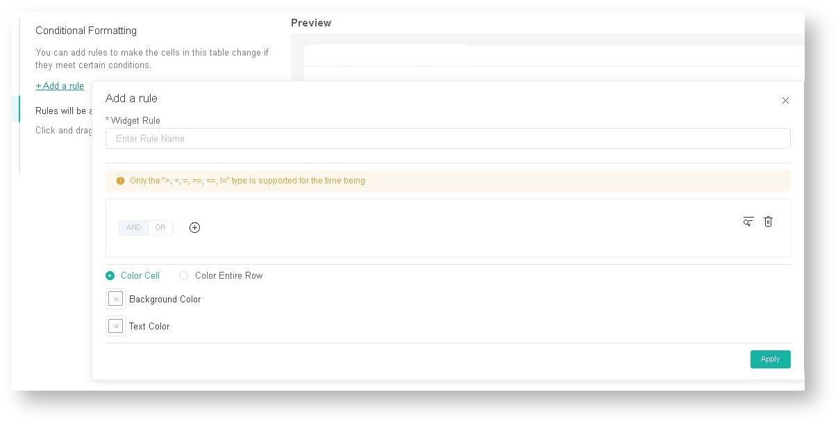
- If you want to change the text or background color when the fields and measures meet specific conditions, set a conditional formatting rule for your line chart. Go to Conditional Formatting and add rules to define the conditions. Once a rule is set, click Apply on the widget rule window.
- Lastly, click Apply on the widget to show a preview of the widget.
How to create a stacking line widget
Stacked line charts help you visualize the relative contribution of different variables over a specified time. You can create this kind of chart for your widget by following the procedure for creating a line chart and selecting the Stacked Area Style option in the MSPbots app Widget Builder.
After filling the fields under Config in Step 11 for creating a line chart, scroll down and select the Stacked Area Style option.

Video Instructions
Watch this video or follow the procedure below to create a line chart widget.
Overview
Content Tools
N O T I C E
MSPbots WIKI is moving to a new home at support.mspbots.ai![]() to give you the best experience in browsing our Knowledge Base resources and addressing your concerns. Click here
to give you the best experience in browsing our Knowledge Base resources and addressing your concerns. Click here![]() for more info!
for more info!