 N O T I C E
MSPbots WIKI is moving to a new home at support.mspbots.ai to give you the best experience in browsing our Knowledge Base resources and addressing your concerns. Click here for more info!
N O T I C E
MSPbots WIKI is moving to a new home at support.mspbots.ai to give you the best experience in browsing our Knowledge Base resources and addressing your concerns. Click here for more info!
MSPbots Widgets help you to quickly view key data and highlight action items at a glance. This article shows how you can start creating your own widget which you can further customize according to your business needs.
Do these steps to create a Column widget:
- On the MSPbots menu, navigate to Widgets.
- On the Widgets tab, click New Widget.

3. Choose the Column widget type on the New Widget window.
4. When the Widget Builder window opens, provide the following:
- Name - Give the widget a Name.
- Description - Provide a short Description.
- Role - Select User or Admin.
- Click the Apply button.

5. Click More Edits located the bottom left corner. When the More Edit window opens, provide the following:
- DA - Provide DA name
- Status - Provide the current widget status of the widget.
- Type - Select Custom or Template.
- Client - Select the right client
- PO - Select the PO for the client
- Jira Number - Provide the Jira Number
- Click the Save button.

6. Go to Dataset and click  button.
7. Click New Layer on the Add New Layer window that appears.
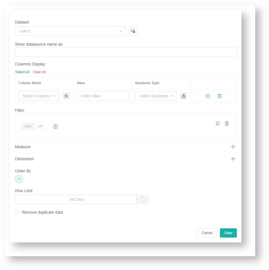
8. Do the following on the Dataset window:
- Select a dataset to use.
- Add columns by selecting an option from the Column Name dropdown list and assigning an Alias and Business Type for each. Click the + icon to add more rows.
- Add filters, measures, and dimensions.
9. Click the Save button.
10. Click Apply. This will show a preview of the target card that you created.
11. Next, go to Config and provide data for the following fields:
- Bar Chart Title - Provide the Bar Chart Title that will indicate the title of the data being presented
- Dimension - Select the data that will be in the x (horizontal) axis of the bar chart.
- Measure - Select the data that will be in the y (vertical) axis of the bar chart.
- Measure Color - Select which color is appropriate for the y (vertical) axis of the bar chart.
- Trendline - Select a preferred trendline on the dropdown list, if necessary.
- Set Goal - Provide a preferred set goal, if necessary.
- Goal Color - Select which color is appropriate for the set goal.
- Measure-line - Select a preferred measure-line on the dropdown list, if necessary
- Dimension Group - Select a preferred dimension group on the dropdown list, if necessary.
- Type - Select a preferred type of Bar Chart (Stacking Column, Column, Bar) on the dropdown list, if necessary.
- Dimension Name - Provide the name that will be in the x (horizontal) axis of the bar chart.
- Measure Name - Provide the name that will be in the y (vertical) axis of the bar chart.
- yAxis NameLocation - Select a preferred location for the Measure Name (Start, Center, End) on the dropdown list, if necessary.
- yAxis NameGap - Provide a preferred number of gap for Measure Name, if necessary.
- yAxis NameRotate - Provide a preferred orientation for Measure Name, if necessary.

12. If you want to change the text or background color when the fields and measures meet specific conditions, set a conditional formatting rule for your target card. Go to Conditional Formatting and add rules to define the conditions. Once a rule has been set, click Apply on the widget rule window.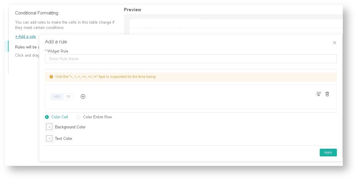
13. Lastly, click Apply on the widget to show a preview of the target card.
Overview
Content Tools
N O T I C E
MSPbots WIKI is moving to a new home at support.mspbots.ai to give you the best experience in browsing our Knowledge Base resources and addressing your concerns. Click here for more info!