 N O T I C E
MSPbots WIKI is moving to a new home at support.mspbots.ai![]() to give you the best experience in browsing our Knowledge Base resources and addressing your concerns. Click here
to give you the best experience in browsing our Knowledge Base resources and addressing your concerns. Click here![]() for more info!
for more info!
Page History
MSPbots Widgets help you to quickly view A column chart is one of the widget types that MSPbots users can utilize to highlight key data and highlight action items at a glance. This article shows how you can start creating your own widget which you can further customize according to your business needs.Do these steps to create a Column widget:identify actionable items for members, managers, and owners of MSPs. This widget type is helpful when comparing data that is presented in columns, bars, or stacking columns. Read this article to learn how to create a column chart widget.
| Note |
|---|
The procedure below required admin access. Before starting, ensure that you are logged in to MSPbots as an administrator. |
To create a column widget
...
- On the MSPbots menu, navigate to Widgets.

- On the Widgets tab, click New Widget.


- Browse the widget types
...
- on the New Widget window and select Column Chart.
...

...
- When the Widget Builder window opens, provide the following
...
- , then click the Apply button.
- Name - Give the widget a
...
- name.
- Description - Provide a short
...
- description.
- Role - Select
...
- User or
...

5. Click More Edits located the bottom left corner. When the More Edit window opens, provide the following:
- DA - Provide DA name
- Status - Provide the current widget status of the widget.
- Type - Select Custom or Template.
- Client - Select the right client
- PO - Select the PO for the client
- Jira Number - Provide the Jira Number
- Click the Save button.

...
- Admin.
- Admin.
...
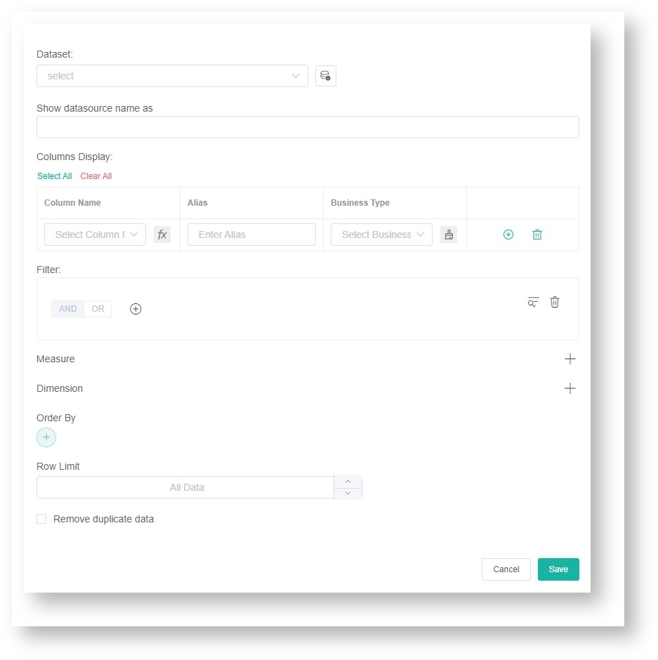
- Go to Dataset

- and click

...
- sign.
...

...
- Click New
...
- Layer on the Add New Layer window that appears.
...

...
- Do the following on the Dataset window:
- Select a
...
- Dataset to use and provide a name for this.
- Add columns by selecting an option from the Column Name dropdown list and assigning an Alias and Business Type for each.
- Click the
...
- icon to add more rows.
- Add filters, measures, and dimensions.
-
9. Click the Save button.
...
- Choose a value for Order By and input for Row Limit, if necessary.
- Click the Save button.

- Click Apply. This will show a default preview of the
...
- column chart that you created.
...
- Next, go to Config and provide data for the following fields:
...
- Bar Chart Title - Provide
...
- a title for the data being presented.
- Dimension - Select the data
...
- for the x-axis (horizontal)
...
- of the bar chart.
- Multiple Measure - If this is not selected, the y-axis will have one measure. If selected, there will be multiple measures on the y-axis, such as the left y-axis and the right Y-axis.
- Measure - Select the data
...
- for the y-axis (vertical)
...
- of the bar chart.
- Measure Color - Select
...
- the color
...
- for the y
...
- -axis of the bar chart.
...
- Show Column Limit - Set the number of columns to display on the Column Chart. For example, setting it to 3 will display 3 columns.
- Trendline - Select the preferred trendline from the dropdown list, if necessary.
- Label Font Size - Set the font size for the label.
- X-Axis Font Size - Set the font size for the x-axis.
- Set Goal - Provide
...
- the preferred set goal, if necessary.
- Goal Color - Select
...
- a color
...
- for the set goal.
- Measure-
...
- Line - Select
...
- the preferred measure-line
...
- from the dropdown list, if necessary.
- Dimension Group - Select
...
- the preferred dimension group
...
- from the dropdown list, if necessary.
- Type - Select
...
- the StackingColumn, Column, or Bar
...
- from the dropdown list, if necessary.
- stacked Statistics - Enable this switch to display the column chart using stacked statistics.
- stacked Statistics Sort - Select descending or ascending to sort the stacked statistics.
- Dimension Name - Provide
...
- a name for the x
...
- -axis of the bar chart.
- Measure Name - Provide
...
- a name for the y
...
- -axis of the bar chart.
- yAxis Percentage -Selecting this option will display the percentage on the y-axis.
- Right yAxis Coordinate - If selected, it will display the coordinates on the right x-axis.
- Use Right yAxis
- -axis of the bar chart.
...
- Measure - Select the measure to be used for the right y-axis.
- Right yAxis Label Name - Enter the label name for the right y-axis.
- Right yAxis Percentage - Select to display the percentage on the right y-axis.
- yAxis NameLocation - Select start, center, or end as the location for theMeasure Name
...
- from the dropdown list, if necessary.
- yAxis NameGap - Provide
...
- the preferred number of
...
- gaps forMeasure Name, if necessary.
- yAxis NameRotate - Provide
...
- the preferred orientation for Measure Name, if necessary
...

...
- .
- Show Label - The default is to show the labels. Deselect the checkbox for Show Label if you prefer not to show these.
- Split Line Show - Select the checkbox for Split Line Show if you wish to show the split lines.
- Label Format - You can configure the Label Format with the following tokens:
- {x_val}: The value of the x-axis
- {x_val2}: The dimension value of the legend
- {y_val}: The total value of the y-axis in the bar chart
- {y_val2}: If a stacked bar chart is selected, this is the value of each part of the y-axis.
- {measure_name}: The name of the y-axis

- Click Apply to save the settings.
- Go to Conditional Formatting
- . If you want
...
- the text
...
- color to change when the fields and measures meet specific conditions, set a conditional formatting rule for your
...
- column chart. Once a rule
...
- is set, click
...
- Apply on the
...
- Add a rule window.

...
- Lastly, click
...
- Apply on the Widget Builder window.
widget to show a preview of the target card.
Overview
Content Tools