 N O T I C E
MSPbots WIKI is moving to a new home at support.mspbots.ai![]() to give you the best experience in browsing our Knowledge Base resources and addressing your concerns. Click here
to give you the best experience in browsing our Knowledge Base resources and addressing your concerns. Click here![]() for more info!
for more info!
Page History
What is a Heatmap widget? It's a widget that has similarities with bar and line chart. A graphical representation of data where values are depicted by color that shows the hot and cold spots area.
This hotspot helps determines or understand certain trend and behavior in your data that may aid you on your critical analysis, business questions, and goals.

...
1. Login to MSPBots.ai site
2. Hover to Widget menu.
3. Click + New Widget button
4. Select Heatmap widget

5. Add a Name and Description

6. Add/Edit a Role allowed to access. (Default: Admin, User and Dashboard Only)

7. Click Apply
8. Click the Datasource icon. Then, click + Add Dataset and select New Layer.

9. Select a Dataset to use. e.g ConnectWise Tickets Statistics - Cloud

10. Add new columns and filters e Columns and Filters. E.g. columns for hours_actual (with round off function), date_resolved, ticket_number, resolved_by and filter by date_resolved in the last 14 days)

11. Add function for certain columns (if needed). At the column display, hover into the column you want to add a function. Then, click fx icon.

E.g. At column hours_actual add field formula to round off hours (this is to return real hour values w/out decimal). Click, Save to save function for that column.
1211. Add and Setup Measure (Measures are aggregates like sum. max, avg, and count). e.g., Ticket count measure.

1213. Add and Setup Dimension (Dimensions is used for Grouping By data). e.g., group by for Actual Hours, Date and Resolved by.

1413. Click Save to save setup.
15. You can also add Order by option for your result. Click + Order By and select an option.

To set either ascending or descending results click the ![]() arrow.
arrow.
15. Click Apply button to save.
16. To setup .the widget Configuration. Click the Config icon.

17. Set the Chart value results (x-y axis):
A. Dimension - Click the drop selection for the name and give it a name. This is the x-axis value on the chart. E.g. Date
B. Measure - Click the drop selection for measure and give it a name. This is the y-axis value on the chart. E.g. Hours
C. Label - Select the specific Label and give it a name. This is the specific value result show in the chart. E.g. Ticket count by Hours.
D. Show Label checkbox - check to show the label results.
E. Min/Max Value - Set this one up based on the Minimum and Maximum value for the results. This the basis on the color results from Red-Yellow-Green.

18. Set up Chart view:
F. Orient - Setup Heatmap Legend to Horizontal 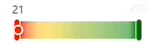 or vertical
 ![]()
G. Grid Top - Percentage distance between the chart space above
H. Left Side Distance - Heatmap Legend location in the chart (Right, Center, Left)
I. Bottom Side Distance - Percentage distance between the chart space below.
J Is Total (toggle switch) - If ON, will calculate the Grand Total between X and Y axis.

19. Click Apply buttonto save.7
Overview
Content Tools